Custom type design for the title of an independent feature film
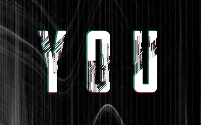
all about our online personas.
Custom type design for the title of an independent feature film
all about our online personas.

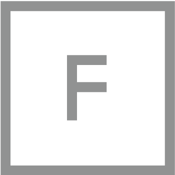
A caps only typeface designed using just enough real estate to keep it legible.

Typography experiment made with graphite powder and a little puff.
A stencil, graphite powder and a little lung capacity makes each phrase or character completely unique.

Title design for Sky Studios original TV series ‘A Town Called Malice’. Custom typography design dripping in 80s vibes with retro blue and pink neons.

Custom designed all caps typeface constructed of perfectly perpendicular strokes that just won’t toe the line. With a maze-like structure these letterforms all have their own rebellious alter-egos whereby the lines flow out of line and into muscle fibre style interweaving curves.

Custom designed all caps typeface. Oh so slightly condensed, very structured letterforms with a few quirks and subtle rounded edges. Family includes a total of four weights; light, book, medium and bold.

Humpit, one of my fave local haunts for a tasty lunch needed some custom typography design for the packaging of their latest offerings. The ‘Hummus Shake’ (don’t knock it til you’ve tried it), their signature ‘Amba Sauce’ and ‘Tahina Cookies’.

When a designer has a persistent yoga habit…I made my yogi pals contort themselves into yogic letterforms purely so I could illustrate them into a full alphabet, because why not? Intended to be used a singular letters rather than to create words or sentences this group of 26 illustrations serves as a minimalist yoga themed display lettering system.