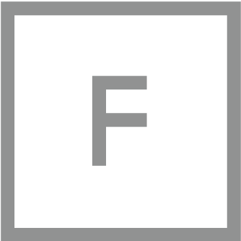


Starting with a geometric baseline structure to each letter, sections were then systematically removed until all that was left was enough for your brain to recognise the letter. What followed was testing the legibility by forming words, and if it became difficult to read, parts of the letterforms were reintroduced until it became easier to recognise.

The typeface was primarily designed as part of an identity development for a CGI company called Riot. The idea came from the logo design process and I made the decision to complete the whole alphabet.